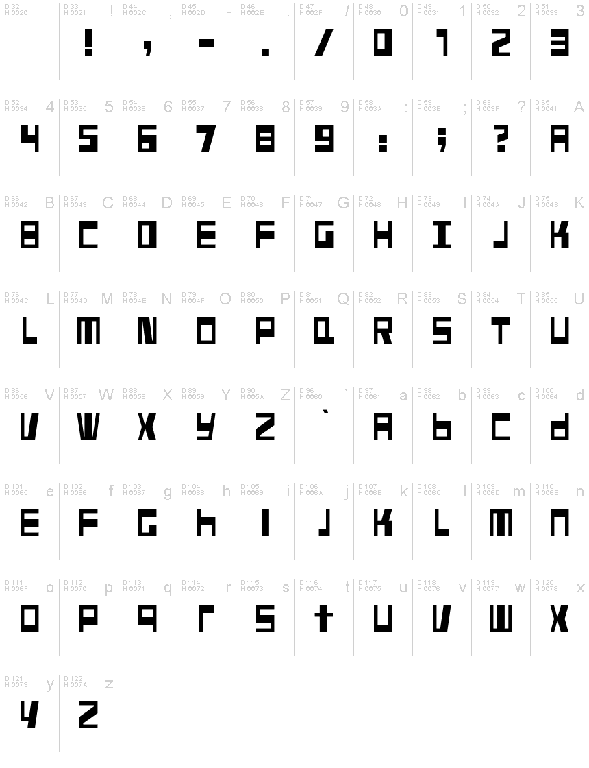
Fundstueck
ترو تايبمجاني
Fundstueck.ttf
علامات
ملاحظة المؤلف
Fundstueck font is a bold techno typeface designed by Ingo Zimmermann of ingoFonts.
Inspired by a rusty piece of metal, a coarse but decorative font was created.
Fonts can be so simple. That is what I was thinking as my attention was turned to this rusty piece of metal. Only a few centimeters in size, I couldnt imagine which purpose it might truly serve. But my eyes also saw an E, even a well-proportioned E: a width to height ratio of approximately 2/3, black and fine strokes with a 1/2 proportion could I create more characters on this basis?
Thought it, did it. The form is based on a 5mm unit.
The strikingly thick middle stroke of E suggests that the emphasis is not necessarily placed on the typical stroke, and likewise with the other characters. But if the font is going to be somewhat legible, then you cannot leave out slanted strokes completely. Eventually I found enough varying solutions for all letters of the alphabet and figures.
A font designed in this way doesnt really have to be extremely legible, which is why I forwent creating lower case letters.
Nevertheless, Fundstueck still contains some diverse forms in the layout of upper and lower case letters. Thus, the typeface is a bit richer in variety.
Fundstueck includes only the alphabet and the usual Western European accents (without the Scandinavian).
Only the most necessary punctuation is included.
By the way the lower letters with accents and umlauts stay between the baseline and cap height. And with that, you get wonderful ribbon-type lines.
خريطة الرموز
لرجاء استخدام قائمة السحب للاسفل لعرض خرائط خط مختلفة داخل الخط الواحد

بيانات الخطوط الاساسية
ملحوظة حقوق الملكية
Copyright (c) 2015 by ingoFonts Ingo Zimmermann. All rights reserved.
الفئة الخطية
Fundstueck
الفئة الفصيلية
Regular
تعريف الفئة الفصيلية
ingoFontsIngoZimmermann: Fundstueck: 2015
اسم الخط بالكامل
Fundstueck
نسخة قائمة الاسم
Version 1.005
اسم خط الحاشية النصية
Fundstueck
ملحوظة العلامة التجارية
Fundstueck is a trademark of ingoFonts Ingo Zimmermann.
اسم الصانع
المصمم
الوصف
Copyright (c) 2015 by ingoFonts Ingo Zimmermann. All rights reserved.
بيانات الخطوط الثانوية
المنصات المدعومة
برنامجترميز
الشفرة الدولية الموحدة - يونيكوددلالات الشفرة الدولية الموحدة 2.0 - BMP فقط
ماكينتوشغربي - روماني
مايكروسوفتنظام الحروف الدولي الموحد - BMP فقط
تفاصيل الخط
منشا2015-04-29
المراجعة1
احصاء الصورية العديدة130
الوحدات لكل دقيقة1000
حقوق التضمينالتضمين لتثبيت دائم
فئة العائلةغير مصنف
الوزنمشدد / ثقيل
العرضمتوسط / عادي
نمط الماكغامق
الاتجاهفقط وبقوة من ألايسر الى يمين الرموز + يحتوي على المحايد
طبيعة النمطلعادية
الاهتزازغير موحدة
