Eyeclipse Regular
ترو تايبجنو/الترخيص
- لهجات (جزئي)
- اوروبي
eyeclipse.ttf
علامات
ملاحظة المؤلف
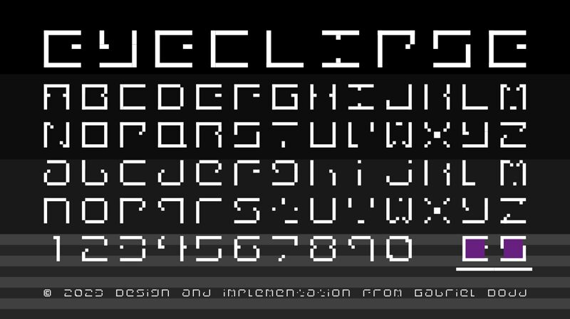
This typography is based on the light eyeshadows of the profile picture, avatar, and icon of an Electronic and Dance music promotion blog, "Eclipse Sounds!", hence why we've named the font "Eyeclipse".
Details: A simple 8-bit style sequence of squared and wide-spaced cryptic characters, leaving one horizontal or diagonal line incomplete, to fit a smaller 6x6 square in the middle, usually a different color, while making it still readable for the majority of people.
We've added some accents, Greek, and Cyrillic characters to make the font look more cryptic. If you have any suggestions about the font, whether if I should add different sets of characters, or to improve the typography more, feel free to let us know. :D
- Gabriel | EclipseSounds2022

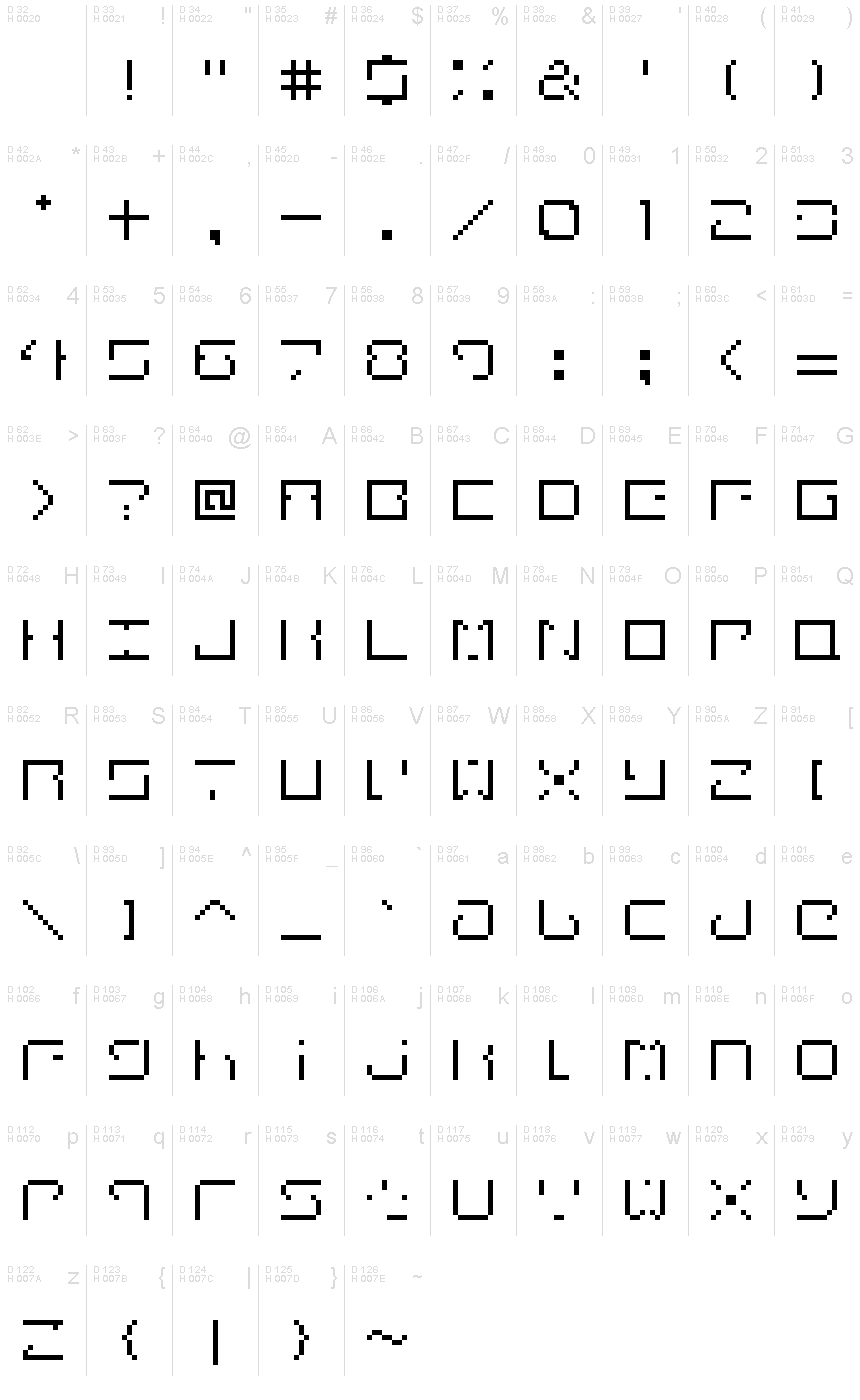
خريطة الرموز
لرجاء استخدام قائمة السحب للاسفل لعرض خرائط خط مختلفة داخل الخط الواحد

بيانات الخطوط الاساسية
ملحوظة حقوق الملكية
Copyright Gabriel Dodd 2023
الفئة الخطية
Eyeclipse
الفئة الفصيلية
Regular
تعريف الفئة الفصيلية
Eyeclipse
اسم الخط بالكامل
Eyeclipse Regular
نسخة قائمة الاسم
Version 1.0
اسم خط الحاشية النصية
Eyeclipse
ملحوظة العلامة التجارية
FontStruct is a trademark of FontStruct.com
اسم الصانع
المصمم
الوصف
“Eyeclipse” was built with FontStruct
Designer description: Our very first implemented typography on the platform.
This typography, or should we say FontStruction, is based on the light eyeshadows of the profile picture, avatar, and icon of an Electronic and Dance music promotion blog, "Eclipse Sounds!", hence why we've named the font "Eyeclipse".
Shoutout to SelolSelel (aka the creator of Same Vocal Sample project) for being the first person to suggest ideas to improve the Eyeclipse typography.
Details: A simple 8-bit style sequence of squared and wide-spaced cryptic characters, leaving one horizontal or diagonal line incomplete, to fit a smaller 6x6 square in the middle, usually a different color, while making it still readable for the majority of people.
We've added some accents, Greek, and Cyrillic characters to make the font look more cryptic. If you have any suggestions about the font, whether if I should add different sets of characters, or to improve the typography more, feel free to let us know. :D
- Gabriel | EclipseSounds2022
بيانات الخطوط الثانوية
المنصات المدعومة
برنامجترميز
الشفرة الدولية الموحدة - يونيكوددلالات الشفرة الدولية الموحدة 2.0 - BMP فقط
مايكروسوفتنظام الحروف الدولي الموحد - BMP فقط
تفاصيل الخط
منشا2023-04-02
المراجعة1
احصاء الصورية العديدة379
الوحدات لكل دقيقة2048
حقوق التضمينالتضمين للمعاينة والسماح بالطباعة
فئة العائلةغير مصنف
الوزنمتوسط إلى خفيف
العرضممتد جداً
نمط الماكغامق
الاتجاهفقط وبقوة من ألايسر الى يمين الرموز + يحتوي على المحايد
طبيعة النمطلعادية