Conradi Square
ترو تايبمجاني
- لهجات (جزئي)
- اوروبي
conradi_square.ttf
علامات
ملاحظة المؤلف
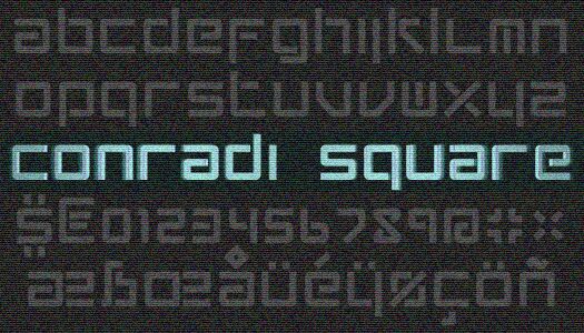
A square, "uncial" font, inspired by a friends' surname and the Carhartt t-shirts that were fashionable half a decade ago. (This text is written in 2014) It's suited best for single-word captions. It has a very complete character set, with many diacritis included, as well as a the euro, pound, yen and dollar sign.
The font has only lower case characters, the uppercase characters being either copies of or variants on (F, L, K, O, V, X, Z) their lower case counterparts. Every character tries to fill up a perfect sqaure (a, b, c, e, m, n, o, r, s, u, v, w, x, z) and tries to use only horizontal and vertical lines. If that's not possible, 45 degree angles are used (k, v and 'capital' z). Ofcourse, being a true lower-case font, ascenders and descenders are used wherever needed.
In this typeface, no intersections have been allowed. Hence, characters like 'x' and '+' make use of 'fly-overs' or 'pylons'. For the 'o', this forced me to make two variants: one that is continuous and one with two 'pylons'. Ciphers are slightly smaller then characters. The German ringel-s () does right to it's origin as a ligature: it's a combination of a slender and low 's'. I could not resist including a Danish/Norwegian .
This font is very suitable to be a used as a stencil. (Just select the right 'o' by using the uppercase variant.)
Free for any use, but if you use it, I would appreciate an e-mail.
FontForge was used to create most diacritics and to export it to a TTF.
By: IDEOGRAM (www.ideogram.nl)
http://www.ideogram.nl/content/conradi-font
خريطة الرموز
لرجاء استخدام قائمة السحب للاسفل لعرض خرائط خط مختلفة داخل الخط الواحد

بيانات الخطوط الاساسية
الفئة الخطية
Conradi
الفئة الفصيلية
Medium
اسم الخط بالكامل
Conradi Square
نسخة قائمة الاسم
Version
اسم خط الحاشية النصية
conradi_square
بيانات الخطوط الثانوية
المنصات المدعومة
برنامجترميز
الشفرة الدولية الموحدة - يونيكوددلالات الشفرة الدولية الموحدة 2.0 - BMP فقط
ماكينتوشغربي - روماني
مايكروسوفتنظام الحروف الدولي الموحد - BMP فقط
تفاصيل الخط
منشا2012-09-08
المراجعة1
احصاء الصورية العديدة179
الوحدات لكل دقيقة115
حقوق التضمينالتضمين للسماح بالتحرير
فئة العائلةغير مصنف
الوزنمتوسط إلى خفيف
العرضممتد
نمط الماكغامق
الاتجاهفقط وبقوة من ألايسر الى يمين الرموز + يحتوي على المحايد
طبيعة النمطلعادية
الاهتزازغير موحدة