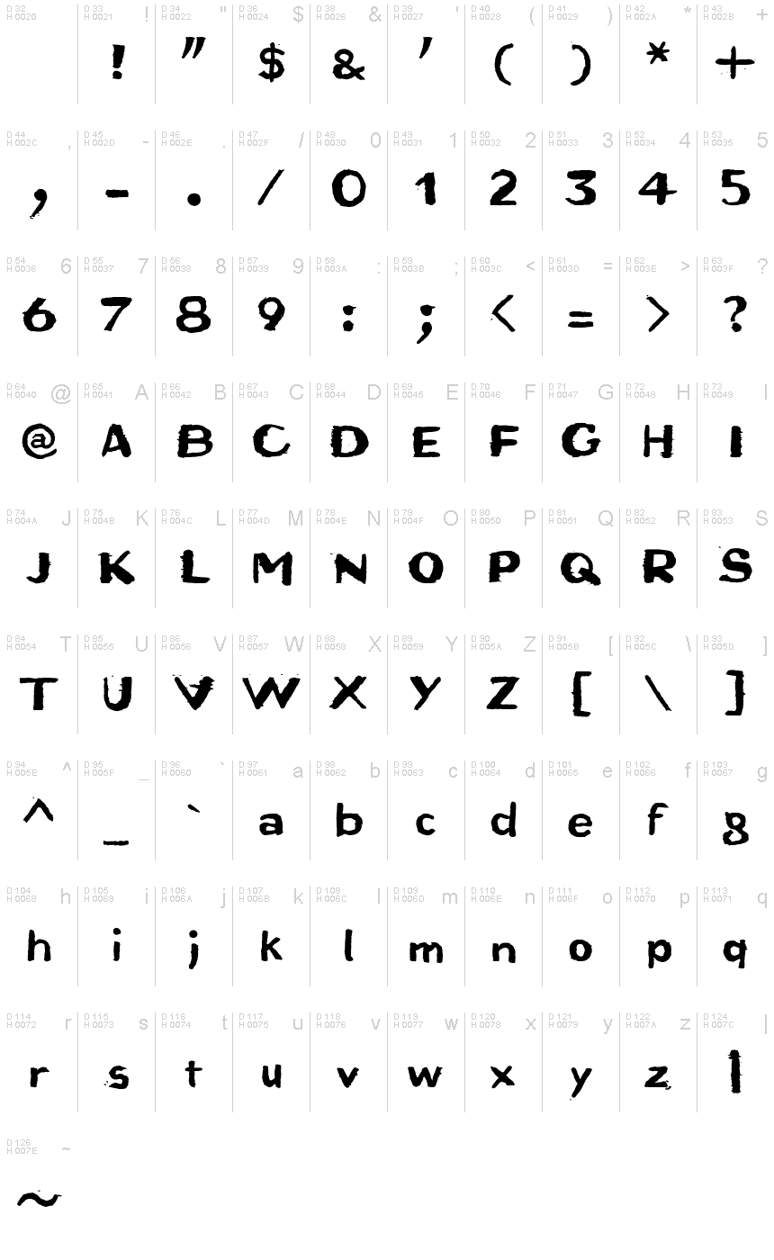
Bruta Woodcut
ترو تايبمجاني
- لهجات (جزئي)
- لهجات (كاملة)
- اوروبي
Bruta_Woodcut.ttf
علامات
ملاحظة المؤلف
Bruta Woodcut font is an eroded display font designed by Ingo Zimmermann.
An alphabet originally carved in wood
The German term for characters or letters is Buchstaben, literally Buche (beech) and Stab (rod or stick), and dates back to the Germanic custom of carving runic characters in beechwood sticks. On New Years Eve, 2014, I used the occasion to cut real beech characters myself. I carved all the characters of this font in woodcarving manner, without tracing and mirror-inverted, in smoothly planed beech rods. After printing on paper, the digital font you see here was created from the negative typeface.
Originally planning an alphabet of capital letters only, I ended up carving figures, punctuation marks and lower case letters after all. The capital letters emphasize alternation between bold and fine strokes, which is familiar in Roman typefaces. In this way, the upper case text in Bruta Woodcut obtains its very own aesthetics.
The ductus on the lower case letters is plainly not as distinct. They look more like a classical sans serif, which becomes clear as the smaller a text is set in Bruta Woodcut, the more legible it becomes.
The original image was negative. In contrast, the font consists of the positive typeface. Bruta Woodcut includes lots of ligatures and stylistic alternates for some symbols.
Thanks to OpenType and Unicode, Bruta Woodcut supports all Western European languages plus Central and Eastern European languages as well as Turkish.
خريطة الرموز
لرجاء استخدام قائمة السحب للاسفل لعرض خرائط خط مختلفة داخل الخط الواحد

بيانات الخطوط الاساسية
ملحوظة حقوق الملكية
Copyright (c) 2015 by Ingo Zimmermann. All rights reserved.
الفئة الخطية
Bruta
الفئة الفصيلية
Woodcut
تعريف الفئة الفصيلية
IngoZimmermann: Bruta Woodcut: 2015
اسم الخط بالكامل
Bruta Woodcut
نسخة قائمة الاسم
Version 1.007
اسم خط الحاشية النصية
Bruta-Woodcut
ملحوظة العلامة التجارية
Bruta Woodcut is a trademark of Ingo Zimmermann.
اسم الصانع
المصمم
الوصف
Copyright (c) 2015 by Ingo Zimmermann. All rights reserved.
بيانات الخطوط الثانوية
المنصات المدعومة
برنامجترميز
الشفرة الدولية الموحدة - يونيكوددلالات الشفرة الدولية الموحدة 2.0 - BMP فقط
ماكينتوشغربي - روماني
مايكروسوفتنظام الحروف الدولي الموحد - BMP فقط
تفاصيل الخط
منشا2015-01-06
المراجعة1
احصاء الصورية العديدة364
الوحدات لكل دقيقة1000
حقوق التضمينالتضمين لتثبيت دائم
فئة العائلةذنابة حرة التشكيل
الوزنمشدد / ثقيل
العرضمتوسط إلى ممتد
نمط الماكغامق
الاتجاهفقط وبقوة من ألايسر الى يمين الرموز + يحتوي على المحايد
طبيعة النمطلعادية
الاهتزازغير موحدة
