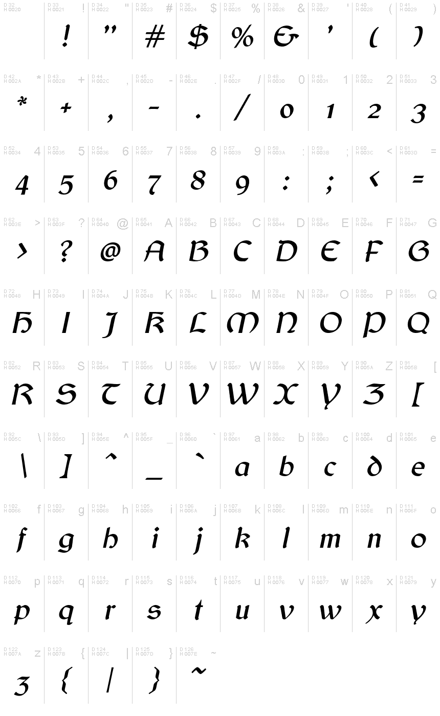
Balgruf Italic
أوبن تايبجنو/الترخيص
- لهجات (جزئي)
- لهجات (كاملة)
- اوروبي
Balgruf_Italic.otf
علامات
ملاحظة المؤلف
Behold the captivating Balgruf Italic font! Designed by the talented Paul Miller, this gothic typeface boasts a Celtic-style flair that is sure to add an enchanting touch to any project. With its semi-light weight, Balgruf Italic is perfect for creating striking headlines and titles, while maintaining legibility. This versatile font is suitable for a range of projects, from fantasy and historical novels to video games and movie posters. Let your creativity run wild with Balgruf Italic – make your designs stand out with this unique and alluring font!
This is a font inspired by the game 'Skyrim', if you have ever played Skyrim and read any of the books there you may have noticed that the upper case 'F' looks out of place and has a very large right side bearing. It looks like a graphic designer with no typographical experience was given the job of making an F on a very tight deadline and this is what he/she came up with. It seems to be cobbled together from pieces of other characters in the font cut up and glued together.
Once you see this mistake you cannot unsee it. As a type designer I thought I could have done better. So the question arose, how would I have done it. This font is the answer to that question.
Enjoy!
خريطة الرموز
لرجاء استخدام قائمة السحب للاسفل لعرض خرائط خط مختلفة داخل الخط الواحد

بيانات الخطوط الاساسية
ملحوظة حقوق الملكية
Copyright (c) Paul James Miller, 2020. All rights reserved.
الفئة الخطية
Balgruf
الفئة الفصيلية
Italic
تعريف الفئة الفصيلية
Balgruf Italic:Version 1.201
اسم الخط بالكامل
Balgruf Italic
نسخة قائمة الاسم
Version 1.201;March 28, 2021;FontCreator 13.0.0.2683 64-bit
اسم خط الحاشية النصية
Balgruf-Italic
اسم الصانع
المصمم
الوصف
As a typographer playing Skyrim by Bethesda I was annoyed by the font used in the books. The upper case 'F' seemed to have been cobbled together from other bits of the font and didn't fit with the aesthetic of the rest of the letters in the font, it also had a right side bearing which was much too large.
As if it had been hastily made by a graphic designer with no experience in typography who was on a strict deadline.
Once you 'see' this mistake you cannot unsee it and it was annoying.
So the question arose, how would I have done it?
This font is the answer to that question.
Enjoy !
As if it had been hastily made by a graphic designer with no experience in typography who was on a strict deadline.
Once you 'see' this mistake you cannot unsee it and it was annoying.
So the question arose, how would I have done it?
This font is the answer to that question.
Enjoy !
بيانات الخطوط الثانوية
المنصات المدعومة
برنامجترميز
الشفرة الدولية الموحدة - يونيكوددلالات الشفرة الدولية الموحدة 2.0 - BMP فقط
ماكينتوشغربي - روماني
مايكروسوفتنظام الحروف الدولي الموحد - BMP فقط
تفاصيل الخط
منشا2020-10-23
المراجعة1
احصاء الصورية العديدة445
الوحدات لكل دقيقة2048
حقوق التضمينالتضمين لتثبيت دائم
فئة العائلةغير مصنف
الوزنمتوسط إلى خفيف
العرضمتوسط / عادي
نمط الماكتسطير النص
الاتجاهفقط وبقوة من ألايسر الى يمين الرموز + يحتوي على المحايد
طبيعة النمطمائل
الاهتزازغير موحدة
الحزمو المكتملة تحتوي على 2 وقيم الخط المدرجة بالاسفل
Balgruf_Italic.otf
Balgruf.otf
Balgruf.otf
Balgruf
أوبن تايبجنو/الترخيص